I have already written a broad thread on the process behind the Indus Valley Report, so this post is not about that.
Instead, this post is more about the things I learned while working on the Indus Valley Report – which is the most I have worked with data visualization and data-led storytelling.
Though I am one for poetic metaphors, I will spare those here and keep this as direct as possible.*
Here are some 14 things I learned about data visualization and data-led storytelling while working on Blume Ventures Indus Valley Annual Report 2025.
On Storytelling with Data
1. While collecting data, be data-first. While presenting insight, be narrative-first.
2. Like long-form prose, reports, and slides should have a plot. There should be data for the beginning, middle and end. There should be data for something that has happened, why it happened, and what is its impact. Organize your slides from left to right.
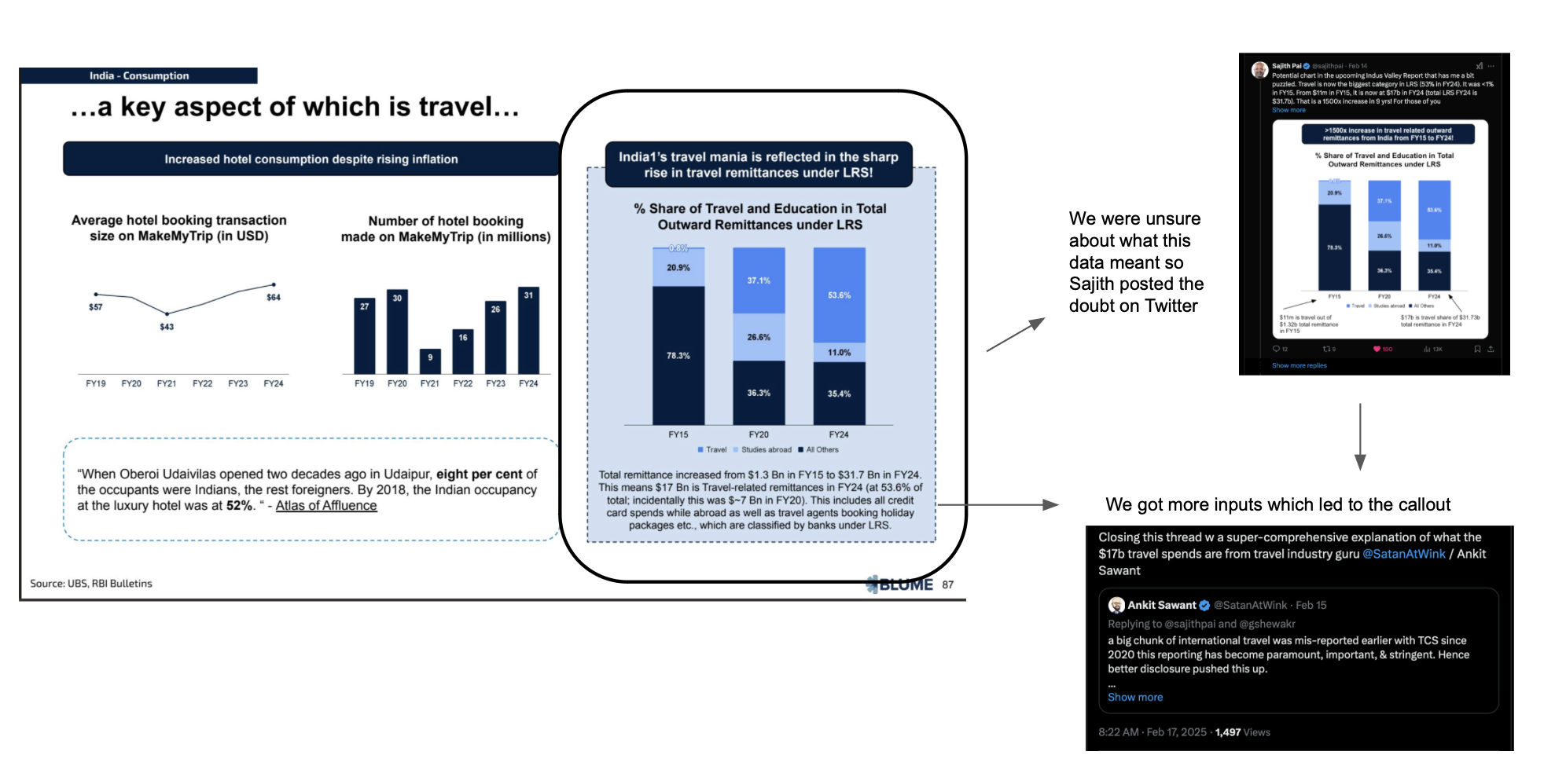
3. Data without context is just numbers. Data is a living thing; that is why it needs context. Though callouts might crowd the screen, adding them is better than not adding them, because they allow an honest and more complete understanding.
This leads to a fuller realization of the complexity of the subject matter instead of just a haphazard schizophrenic burst of information from various lenses.
This sounds a bit extreme, but the data on LRS transfers below is a great example. The callout does not create doubt; it establishes faith and nuance.
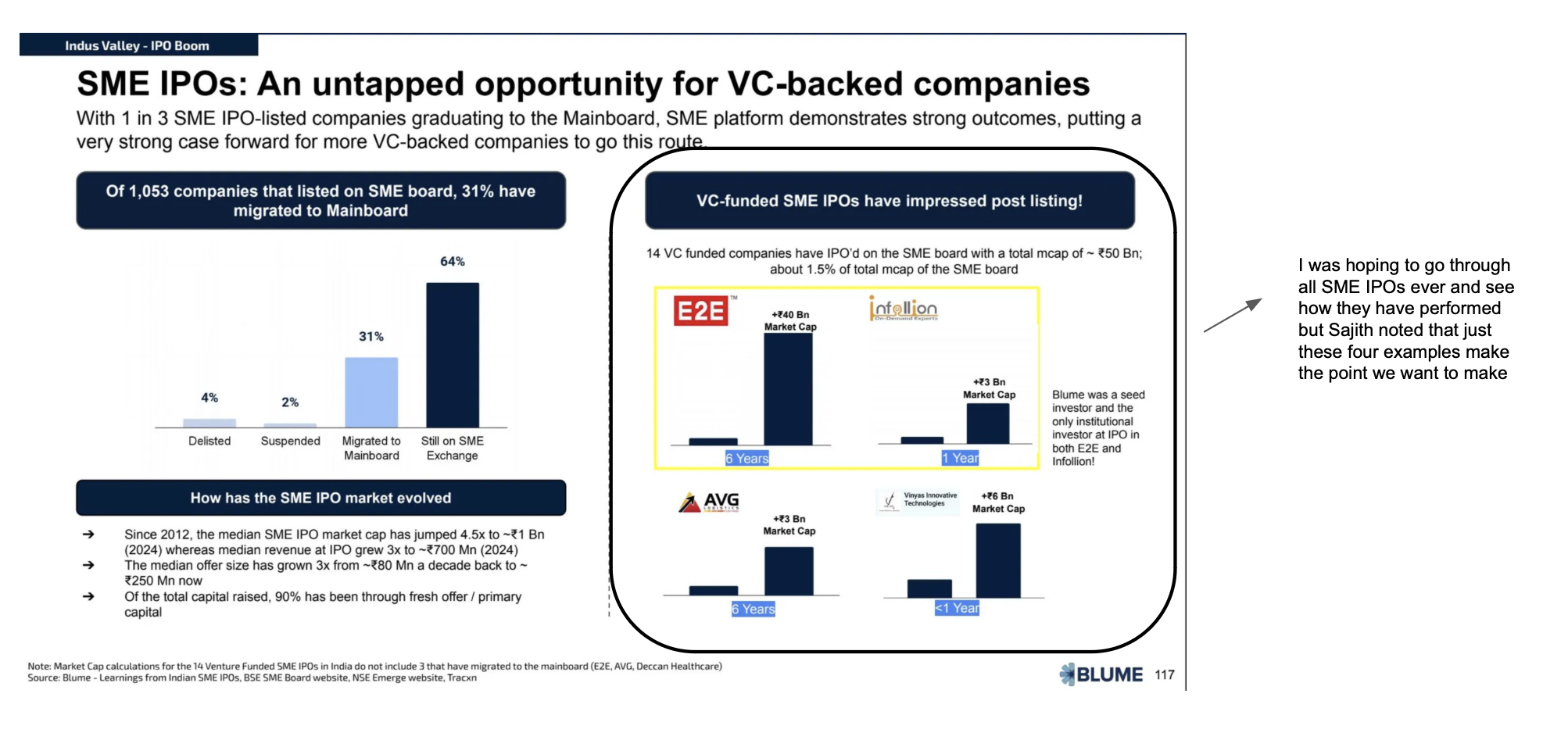
4. There’s always more data, but more isn’t always better. The goal is not to show everything—it’s to show enough. A strong data story comes from selecting and curating the right data points.
This came through on slide 117, for example, with SME IPO success stories.
On Chart Design & Visual Clarity
5. Just as all slides should say one thing, all charts should say one thing. Avoid two-axis charts. They’re just hard to read. Organize your charts from top to bottom. Put the legend upfront and state the units in the title.
6. There is no point in charts that do not have labels. Not all charts need an axis if you have a label. Always err toward adding labels; skip only if absolutely necessary, but include the axis in that case.
7. I know what the last point says, but because there are 10 data points on a chart, you don’t need 10 labels. If you show a trend, plot all data points, add an axis or show a few.
8. Color is your friend. There are only a few ways to tell a data-led story without data transformation, and color is one.
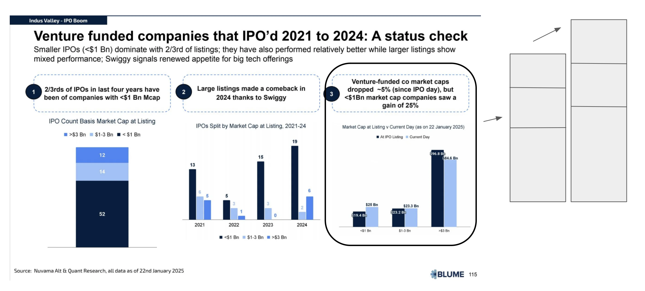
9. Think carefully about the charts you choose. Line charts are excellent for emphasizing longevity, but use bar charts to stress volumes. The way you cut your data matters a lot. What drives this should not be the whim of the data analyst but the narrative.
For example, in slide 115, it was better to show the increase or change in market cap bucketed by the market cap categories instead of showing the total market cap change stacked with the three market cap categories.
On Execution & Workflow
10. If you have to make a lot of charts, start by setting a sheet-wide theme. It will save you so much time later, and charts will look beautiful right from the start, which makes life fun.
11. Some things you should just do in the moment—for example, linking sources to data. Do not put this off until later; do it then. If you schedule to do it later you won’t have ready context and will have to invest scarce cognitive energy in recalling and corroborating the chart and source. If you do it then you will save this cognitive overhead.
12. Some slides should have one chart, and some should have three. You have to take a call. Don’t make everything the same—have some context setting and some high-impact slides.
13. Public market data is a god’s blessing. The lack of standard private market data is a boon but an opportunity. Some sources that are a blessing are: IMF Ministry of Statistics and Programme Implementation, PRS Legislative Research, World Bank Open, GoI Press Information Bureau, SEBI Public Issues, Bank for International Settlements, CRIF High Mark Reports, NSE Reports, BSE Reports, AMFI India, NPCI Statistics, ONDC Open Data, RBI, International Labour Organisation, CMIE
14. All AI tools are suitable for chart reading and interpretation, but extraction is not fault-proof. It is especially bad for any charts or tables where numbers, colors, titles, etc are similar to one another. A great workflow is to take a chart or image, screenshot it, and ask PPLX to find the source.
Note:
*In an early draft of this I had written that sitting in meetings and watching Sajith and team bring together the report from scattered thoughts and threads to a structured narrative—felt like watching Michelangelo carve David from a single large block of stone,’ but a friend and Sajith both remarked that it came off as hyperbole.
This was the metaphor that occurred to me when I started writing though. So it must remain so.
I have talked of a similar craft and expertise in synthesis of insight w.r.t. founders who know their markets very well here while referring to the founders at Stoa.
Glad to know that I am not in bad company in the list of people who think the same about Indus Valley.